Basic example: choose a car
First we configure the notebook so we can plot figures (first line), and also we have autocompletion.
[1]:
%matplotlib inline
%config Completer.use_jedi = False
Problem formalization
The beginning of all problem resolution is to formalize the problem. In Multi-Criteria Decision Analysis, one such problem can consist of choosing one alternative among a set.
[2]:
alternatives = ["Fiat 500", "Peugeot 309", "Renault Clio", "Opel Astra", "Honda Civic", "Toyota Corolla"]
We can list criteria that are considered relevant to make that choice:
[3]:
criteria = ["cost", "fuel consumption", "comfort", "color", "range"]
Those criteria can have different types of scales associated to them and are in general heterogeneous: * The cost in euros is to be minimized * The fuel consumption in L/100km is to be minimized * The comfort can be rated with stars, and must be maximized * The color is way more subjective and can be associated to a ranking (here the decider prefers red cars and hates grey ones) * The range is in km and must be maximized
We must therefore enter the limits of those scales for the current MCDA problem and associate non-numeric criteria values to numeric values if we want to make computations later on.
[4]:
from mcda import PerformanceTable
from mcda.scales import *
[5]:
scale1 = QuantitativeScale(6000, 20000, preference_direction=MIN)
scale2 = QuantitativeScale(4, 6, preference_direction=MIN)
scale3 = QualitativeScale({"*": 1, "**": 2, "***": 3, "****": 4})
scale4 = QualitativeScale(
    {"red": 1, "blue": 2, "black": 3, "grey": 4},
    preference_direction=MIN
)
scale5 = QuantitativeScale(400, 1000)
scales = {
    criteria[0]: scale1,
    criteria[1]: scale2,
    criteria[2]: scale3,
    criteria[3]: scale4,
    criteria[4]: scale5
}
Then we can gather the data for each alternative and criterion in a performance table:
[6]:
performance_table = PerformanceTable(
    [
        [9500, 4.2, "**", "blue", 450],
        [15600, 4.5, "****", "black", 900],
        [6800, 4.1, "***", "grey", 700],
        [10200, 5.6, "****", "black", 850],
        [8100, 5.2, "***", "red", 750],
        [12000, 4.9, "****", "grey", 850]
    ],
    alternatives=alternatives,
    criteria=criteria,
    scales=scales,
)
performance_table.data
[6]:
| cost | fuel consumption | comfort | color | range | |
|---|---|---|---|---|---|
| Fiat 500 | 9500 | 4.2 | ** | blue | 450 |
| Peugeot 309 | 15600 | 4.5 | **** | black | 900 |
| Renault Clio | 6800 | 4.1 | *** | grey | 700 |
| Opel Astra | 10200 | 5.6 | **** | black | 850 |
| Honda Civic | 8100 | 5.2 | *** | red | 750 |
| Toyota Corolla | 12000 | 4.9 | **** | grey | 850 |
To orient the decision process, it is important to visualize the data on which we will base the decision: the performance table
[7]:
from mcda.plot import *
[8]:
fig = Figure(ncols=2, figsize=(6.4, 9.6))

x = [*range(len(alternatives))]
xticks = x
xticklabels = alternatives
for i in criteria:
    values = performance_table.criteria_values[i].data
    ax = fig.create_add_axis()
    ax.title = i
    ax.xlabel = "alternatives"
    ax.ylabel = "performances"
    yticks = None
    yticklabels = None
    y = values
    if isinstance(scales[i], QualitativeScale):
        y = [scales[i].value(v) for v in values]
        yticklabels = scales[i].range()
        yticks = [
            scales[i].value(yy) for yy in yticklabels
        ]
    elif isinstance(scales[i], NominalScale):
        yticklabels = scales[i].range()
        yticks = [*range(len(yticklabels))]
        y = [yticks[yticklabels.index(v)] for v in values]
    ax.add_plot(
        BarPlot(
            x,
            y,
            xticks=xticks,
            yticks=yticks,
            xticklabels=xticklabels,
            yticklabels=yticklabels,
            xticklabels_tilted=True
        )
    )
fig.draw()
/home/nduminy/pymcda/src/mcda/internal/plot/plot.py:296: UserWarning: Matplotlib is currently using module://matplotlib_inline.backend_inline, which is a non-GUI backend, so cannot show the figure.
  self.fig.show()

It is quite difficult to take a decision solely based on this graph, we can therefore start a multistep decision process.
Decision process
We can easily check that not all performances from our performance table are numeric, which makes them hard to compare:
[9]:
performance_table.is_numeric
[9]:
False
To compare those performances, we can transform them all to numeric values. We could use the mcda.transformers module for that, however a simple conversion to numeric values is direcly possible through the PerformanceTable to_numeric property:
[10]:
performance_table.to_numeric.data
[10]:
| cost | fuel consumption | comfort | color | range | |
|---|---|---|---|---|---|
| Fiat 500 | 9500 | 4.2 | 2 | 2 | 450 |
| Peugeot 309 | 15600 | 4.5 | 4 | 3 | 900 |
| Renault Clio | 6800 | 4.1 | 3 | 4 | 700 |
| Opel Astra | 10200 | 5.6 | 4 | 3 | 850 |
| Honda Civic | 8100 | 5.2 | 3 | 1 | 750 |
| Toyota Corolla | 12000 | 4.9 | 4 | 4 | 850 |
However the ranges of those numerical values still varies wildly. Furthermore their preference direction may also differ. In other words, we need to normalize them.
The scales contain all information necessary for this operation, they contain also the preferrence order of each criterion (ex: cost must be minimized, range maximized, etc). This way we can also perform the normalization so that normalized criteria values are all in increasing order:
[11]:
from mcda import normalize
[12]:
normalized_table = normalize(performance_table)
normalized_table.data
[12]:
| cost | fuel consumption | comfort | color | range | |
|---|---|---|---|---|---|
| Fiat 500 | 0.750000 | 0.90 | 0.333333 | 0.666667 | 0.083333 |
| Peugeot 309 | 0.314286 | 0.75 | 1.000000 | 0.333333 | 0.833333 |
| Renault Clio | 0.942857 | 0.95 | 0.666667 | 0.000000 | 0.500000 |
| Opel Astra | 0.700000 | 0.20 | 1.000000 | 0.333333 | 0.750000 |
| Honda Civic | 0.850000 | 0.40 | 0.666667 | 1.000000 | 0.583333 |
| Toyota Corolla | 0.571429 | 0.55 | 1.000000 | 0.000000 | 0.750000 |
Radar or spider plot are then a very good way to visualize all the normalized values per alternative and criterion:
[13]:
create_radar_projection(len(alternatives), frame='polygon')

fig = Figure(ncols=2, figsize=(6, 10))
for i in criteria:
    values = normalized_table.criteria_values[i].data
    ax = fig.create_add_axis(
        projection=radar_projection_name(len(alternatives)))
    ax.title = i
    ax.add_plot(
        RadarPlot(
            alternatives,
            values
        )
    )
fig.draw()
/home/nduminy/pymcda/src/mcda/internal/plot/plot.py:296: UserWarning: Matplotlib is currently using module://matplotlib_inline.backend_inline, which is a non-GUI backend, so cannot show the figure.
  self.fig.show()

Sum as alternatives scores
If the user has no priority between the criteria, we can simply compute the score of each alternative by summing all its criteria values:
[14]:
alternatives_values = normalized_table.sum(axis=1)
alternatives_values.data
[14]:
Fiat 500          2.733333
Peugeot 309       3.230952
Renault Clio      3.059524
Opel Astra        2.983333
Honda Civic       3.500000
Toyota Corolla    2.871429
dtype: float64
We have a winner! Or at least a ranking that will inform the user for its choice.
[15]:
x = [*range(len(alternatives))]
plot = BarPlot(
    x, alternatives_values.data, xticks=x,
    xticklabels=alternatives, xticklabels_tilted=True
)
plot.draw()
plot.axis.title = "alternatives score"
plot.axis.xlabel = "alternatives"
plot.axis.ylabel = "score"
plot.axis.figure.draw()
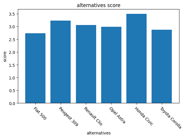
However, our user can also assign a different importance to each criterion.
Weighted sum as alternatives scores
The simplest way to formalize different criteria importance, it to define a weight for each criterion.
Our user is really interested by range of its future car, comfort is also important, but the cost is not an issue:
[16]:
from mcda.mavt.aggregators import WeightedSum

weighted_sum = WeightedSum({
    criteria[0]: 1,
    criteria[1]: 2,
    criteria[2]: 3,
    criteria[3]: 2,
    criteria[4]: 4
})
We can then multiply each normalized criterion value in the performance table by the corresponding criterion weight. We get the scores per alternative and criterion:
[17]:
weighted_table = weighted_sum.weight_functions(normalized_table)
weighted_table.data
[17]:
| cost | fuel consumption | comfort | color | range | |
|---|---|---|---|---|---|
| Fiat 500 | 0.750000 | 1.8 | 1.0 | 1.333333 | 0.333333 |
| Peugeot 309 | 0.314286 | 1.5 | 3.0 | 0.666667 | 3.333333 |
| Renault Clio | 0.942857 | 1.9 | 2.0 | 0.000000 | 2.000000 |
| Opel Astra | 0.700000 | 0.4 | 3.0 | 0.666667 | 3.000000 |
| Honda Civic | 0.850000 | 0.8 | 2.0 | 2.000000 | 2.333333 |
| Toyota Corolla | 0.571429 | 1.1 | 3.0 | 0.000000 | 3.000000 |
We can visualize those scores, again using for example a spider plot:
[18]:
create_radar_projection(len(criteria), frame='polygon')

fig = Figure(ncols=2, figsize=(6, 10))
for i in alternatives:
    values = weighted_table.alternatives_values[i].data
    ax = fig.create_add_axis(
        projection=radar_projection_name(len(criteria)))
    ax.title = i
    ax.add_plot(
        RadarPlot(
            criteria,
            values
        )
    )
fig.draw()
/home/nduminy/pymcda/src/mcda/internal/plot/plot.py:296: UserWarning: Matplotlib is currently using module://matplotlib_inline.backend_inline, which is a non-GUI backend, so cannot show the figure.
  self.fig.show()

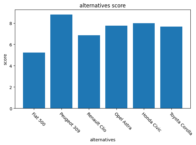
If we compute the alternatives global scores, we get a different ranking:
[19]:
alternatives_values = weighted_table.sum(axis=1)
alternatives_values.data
[19]:
Fiat 500          5.216667
Peugeot 309       8.814286
Renault Clio      6.842857
Opel Astra        7.766667
Honda Civic       7.983333
Toyota Corolla    7.671429
dtype: float64
[20]:
x = [*range(len(alternatives))]
plot = BarPlot(
    x, alternatives_values.data, xticks=x,
    xticklabels=alternatives, xticklabels_tilted=True
)
plot.draw()
plot.axis.title = "alternatives score"
plot.axis.xlabel = "alternatives"
plot.axis.ylabel = "score"
plot.axis.figure.draw()